UX/UI DESIGN | EVALUATIVE RESEARCH
Increasing app orders for laundry services.
Redesigning interface to create intuitive user flow for placing orders.
Role: Usability Researcher, UI/UX Designer
Timeline: 4 weeks ( Jul 2020 - Aug 2020)
Client: Guardini ( Leading Laundry services provider)
Tools: Maze, Figma, Zeplin
Methods: Usability testing, heuristic analysis,
information architecture, prototyping, UI style guide
Team: Software Developers (2), Client (1)

THE IMPACT
50% increase in mobile orders within 2 months of launch of the application.
THE ASK
There are about 100+ app downloads, yet only 1/10 customers are using the app to put orders.
The client had just launched a mobile app to help manage internal operations with increased in service request at the height of pandemic, yet customers preferred calling to book appointments.
THE PROBLEM
Increase the number of orders through mobile app by 100%.
METHOD
Risk vs Clarity Framework guided my process
I took a rapid approach: forming a hypothesis on low app orders, designing a solution, and testing it to ensure improvement.

Given the short timeline and business goals, I used the risk vs. clarity prioritization matrix to guide my process. Client discussions confirmed the clear need for a mobile app, as the pandemic limited in-person services while demand for laundry and dry cleaning remained high.
The client saw the app as a way to streamline operations, with minimal risk since their established customer base allowed for scaling staff if needed.
Low functionality and usability of the app is limiting users to engage with the app
HYPOTHESIS
PROCESS
With this hypothesis, I tested it by conducting a heuristic evaluation and analyzing the information architecture to identify usability issues. I then redesigned the UI, created a brand-aligned style guide, and conducted usability testing on Maze to ensure effectiveness.

PROBLEM IDENTIFICATION
1. Heuristic Evaluation
1. Heuristic Evaluation
The heuristic analysis revealed issues with:
1. Consistency and standards
2. Aesthetic and minimalist design
3. Navigation
I created a report detailing these problems and proposed solutions. After sharing it with the client, they agreed with my findings and requested that the redesign emphasize their premium brand offerings


2. Information Architecture
Heursitic evaluation revealed ui flows errors, for which I redesigned the information.
UI DESIGN
1. UI Style Guide
Based on the heuristic evaluation, information architecture, and style guide, I designed a new app with consistent UI elements, a simple aesthetic, and intuitive user flows for ordering and delivery instructions. The evaluation revealed inconsistencies and a lack of visual hierarchy, leading to the creation of a UI style guide. This guide emphasized the brand’s luxury appeal by incorporating sharp corners for components.
2. Prototypes
_edited.png)
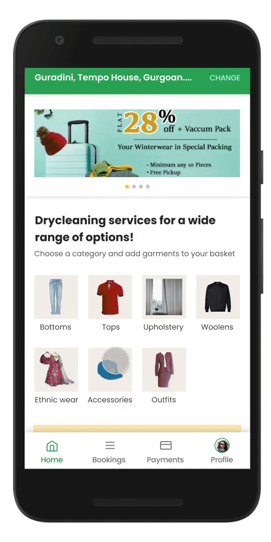
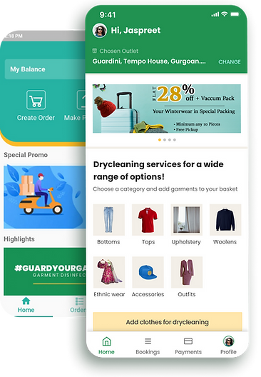
User-flow for placing an order for dry cleaning services was poorly designed, lacked an intuitive navigation, and hence the following prototype was created.

Before


After
USABILITY TESTING
To really understand if the flow for various tasks was intuitive, I conducted unmoderated usability tests with 8 participants on Maze and uncovered 3 major usability issues.
The two questions that I wanted answered from the usability tests were:
-
What’s the perception of users about the brand?
-
What’s the ease of use when placing an order?
Findings
3 major usability issues, which resulted in 75% users not being able to complete the most important flow of adding items to the cart.
-
No way to add items using the booking tab
-
100% Misclicks, when clicking on the item's picture to add it to the cart.
-
100% Misclicks when adding Pickup Details


IMPACT
100% reduction in cart abandonment rate.
50% increase in mobile orders within 2 months.

FUNCTIONING PROTOTYPE